
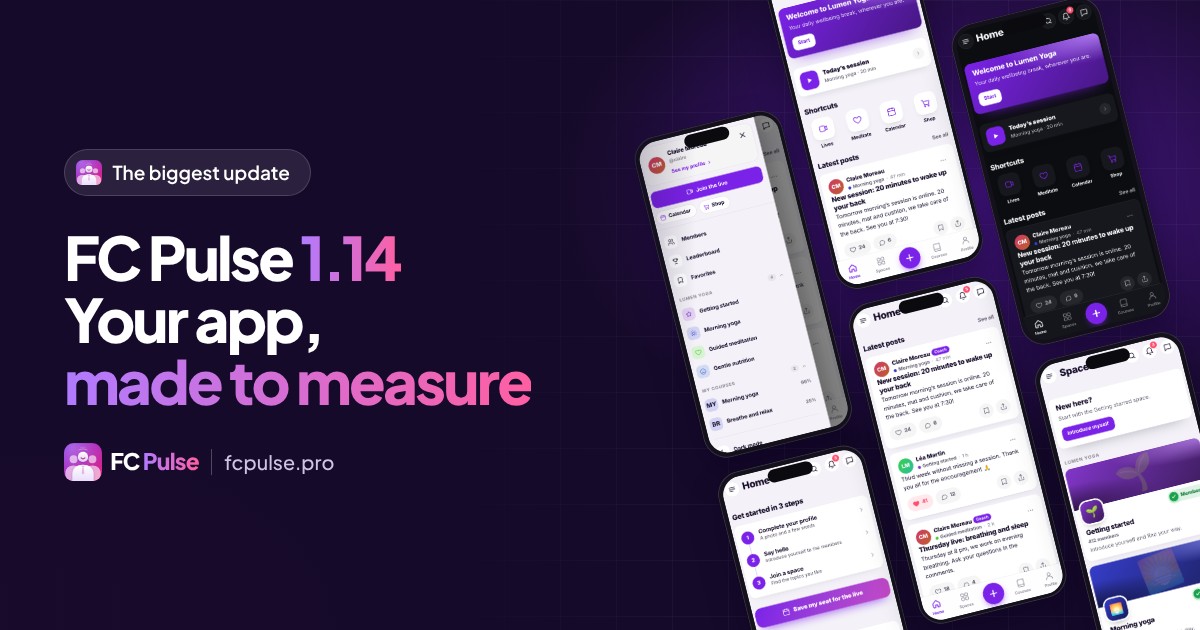
This is the biggest FC Pulse update since launch: 56 new features, 32 improvements and 20 fixes. Your Fluent Community app is now built block by block, wears your brand down to the typography, shows each person the content meant for them, and sends its notifications from your own site.
On October 6, FC Pulse came out in version 1.3.6. I haven’t stopped since.
I used the app on my own community, on my iPhone, and wrote down everything that could go further. The result is version 1.14: your community no longer just has an app, it has its own app, built the way you picture it.
In numbers, this version brings 56 new features, 32 improvements and 20 fixes. I present them here family by family, with what they change for you and for your members. Every line is also in the full changelog of the version.
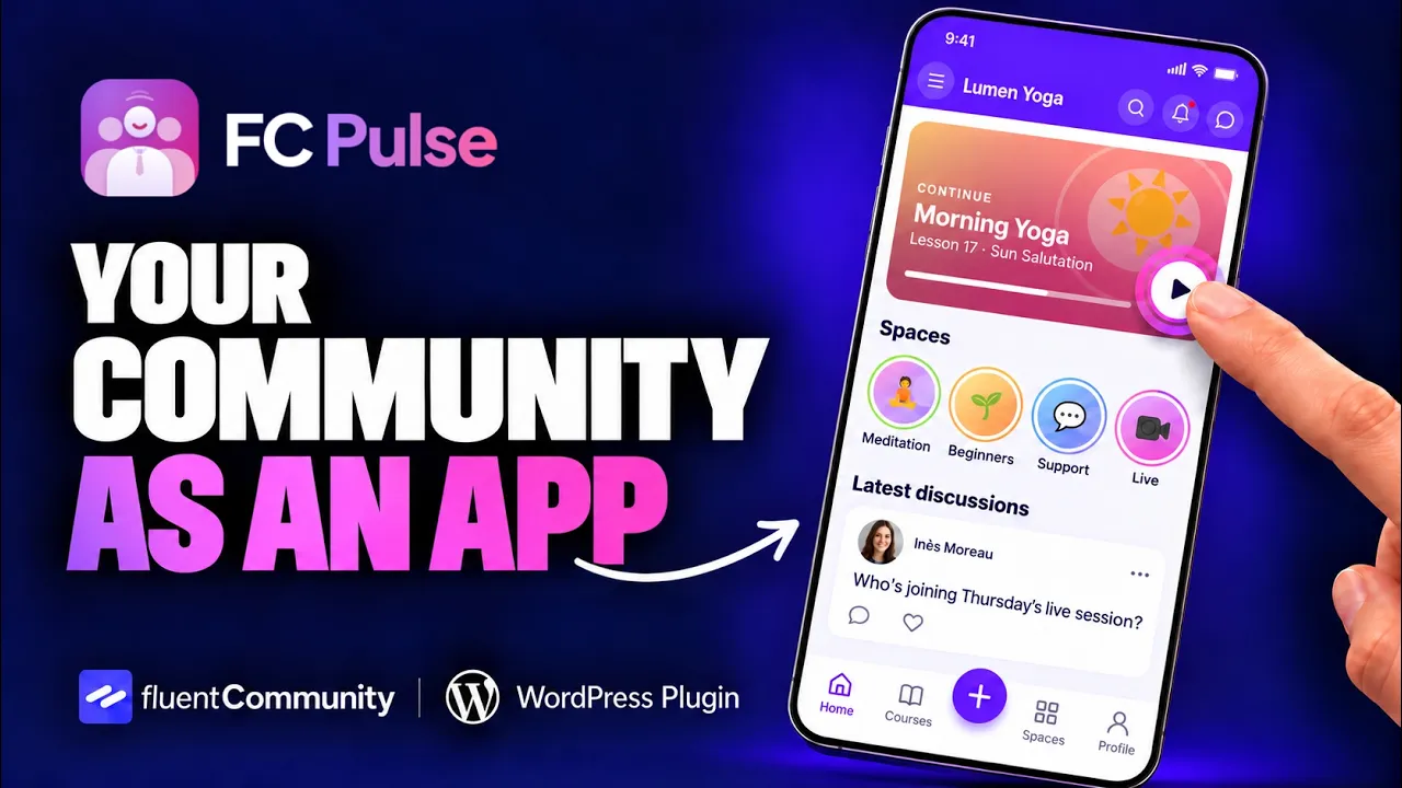
To see FC Pulse in motion before going into the details, here is the video demo:
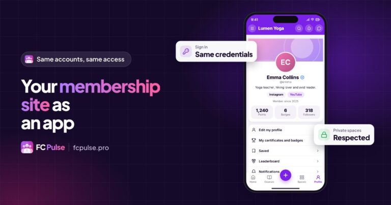
A real Fluent Community app in your pocket
Your members should never feel like they are on a website. The nicer the app, the more they open it, and the more your community thrives. This version gives them all the comfort of a real app.
- Phone gestures. The Android back button and the Safari swipe close the open page or menu, without leaving the app. On iPhone, a swipe from the left edge closes the page, like in every app.
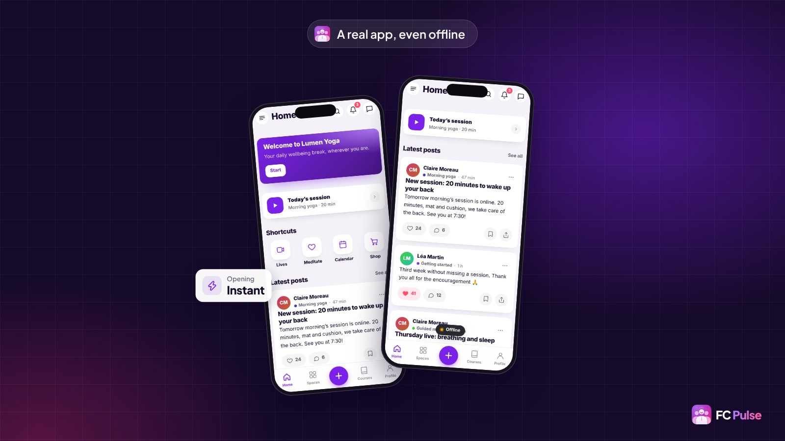
- Instant opening. The member’s latest content shows right away, then refreshes in the background. No more blank screen on opening.
- Pull to refresh, on the Activity feed, spaces, courses, notifications, messages and members.
- Offline reading. Content already seen stays readable on the subway or on a plane, with a small “Offline” pill.
- An app that is always up to date. When you change a menu or a page, the installed app picks it up on its own: when coming back to the app, when pulling down, when opening the side menu, and every two minutes. Your members have nothing to do.
Added to the home screen, the app opens full screen, with the right icon: your Maymoune app’s icon if you have one, otherwise your site’s. The banner that offers installation knows when the app is already installed, and stops coming back. To help your members, I wrote a guide to installing the community on the home screen.
Your brand, down to the typography
Your app should look like your brand in every detail: that is what earns your members’ trust. Design is where this version goes the furthest. You can now change everything, without writing a line of code.
Themes and every color
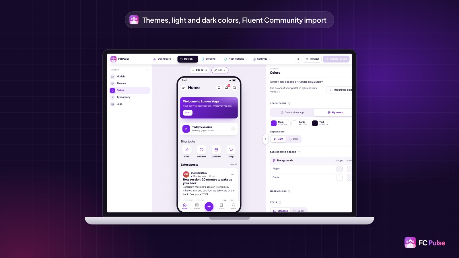
You start from one of the 11 color themes and the ready-made templates, then you fine-tune everything: page and card backgrounds, text, links, buttons, borders, the active item, the bars and the side menu. Each color is set twice, once for light mode and once for dark mode. Corner rounding can be set too, from square to soft.
Your Fluent Community portal already has its colors? One click is enough to import them, light and dark, along with its typography. Your app instantly takes on the identity your members already know.
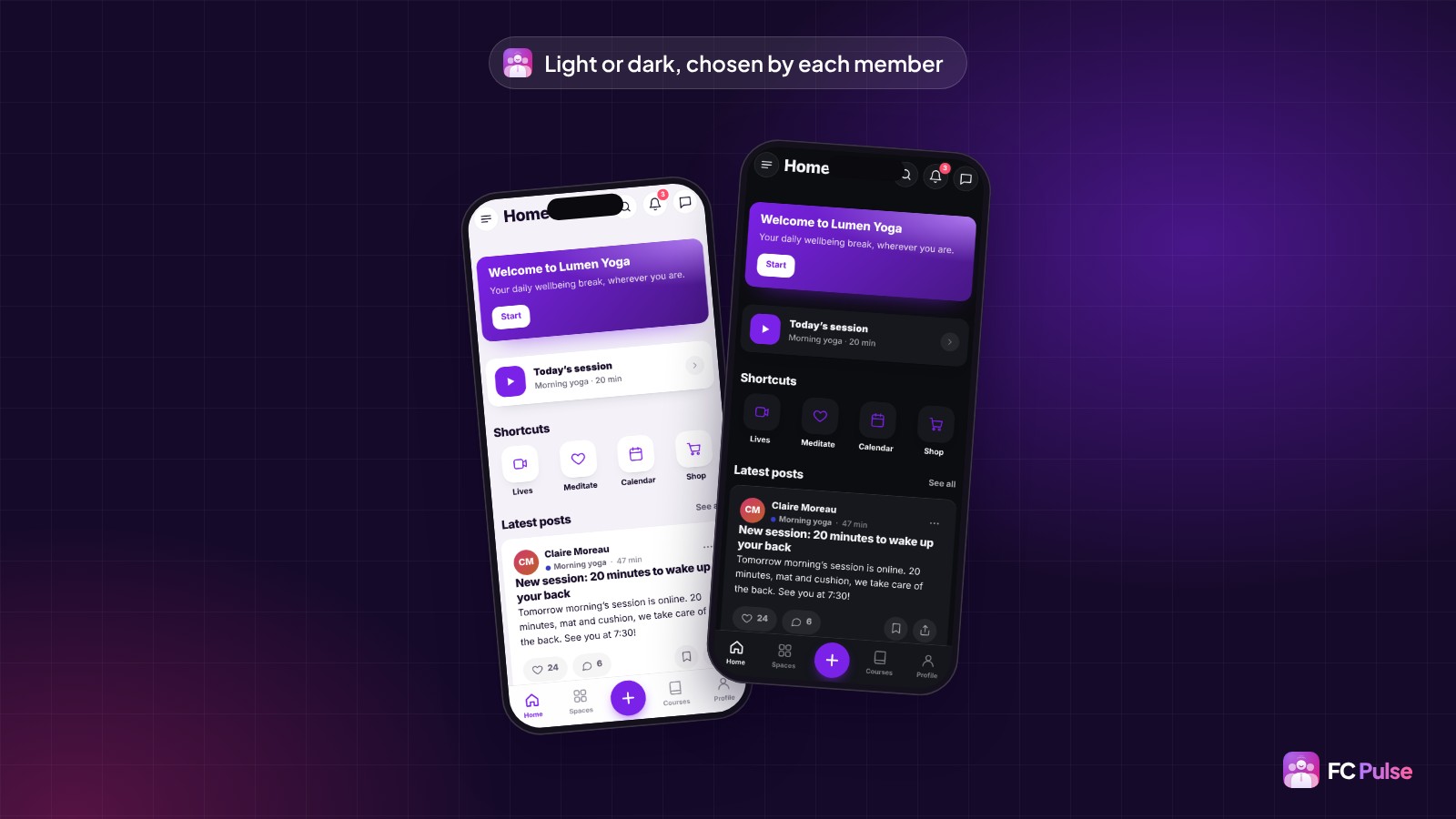
Dark mode, chosen by each member
Each member picks their display: light, dark or automatic, following their phone setting. The choice takes one tap, from the side menu or the profile. You stay in control of the colors of both modes.
Complete typography, and your own fonts
Typography can now be set everywhere: headings, text, menus (top bar, bottom menu, side menu) and even the title of each block. A preview shows you the result before you confirm.
Your brand has its own font? Add your own font files, up to four (WOFF2, WOFF, TTF or OTF). Prefer a Google Fonts typeface? FC Pulse copies it to your site: your members load nothing from Google, a real plus for GDPR.
The finishing touches follow: a new “Sober” template, close to Fluent Community, the phone status bar (time, battery) matching the top of the page, and dedicated colors for the sign-in, sign-up and verification code screens.
Your pages, built from blocks
This is the new feature that changes your way of working the most. You no longer fill an app: you compose it, like a page of your site. A home page to welcome newcomers, a resources page, an events page, a shop: everything becomes possible.
Made-to-measure pages
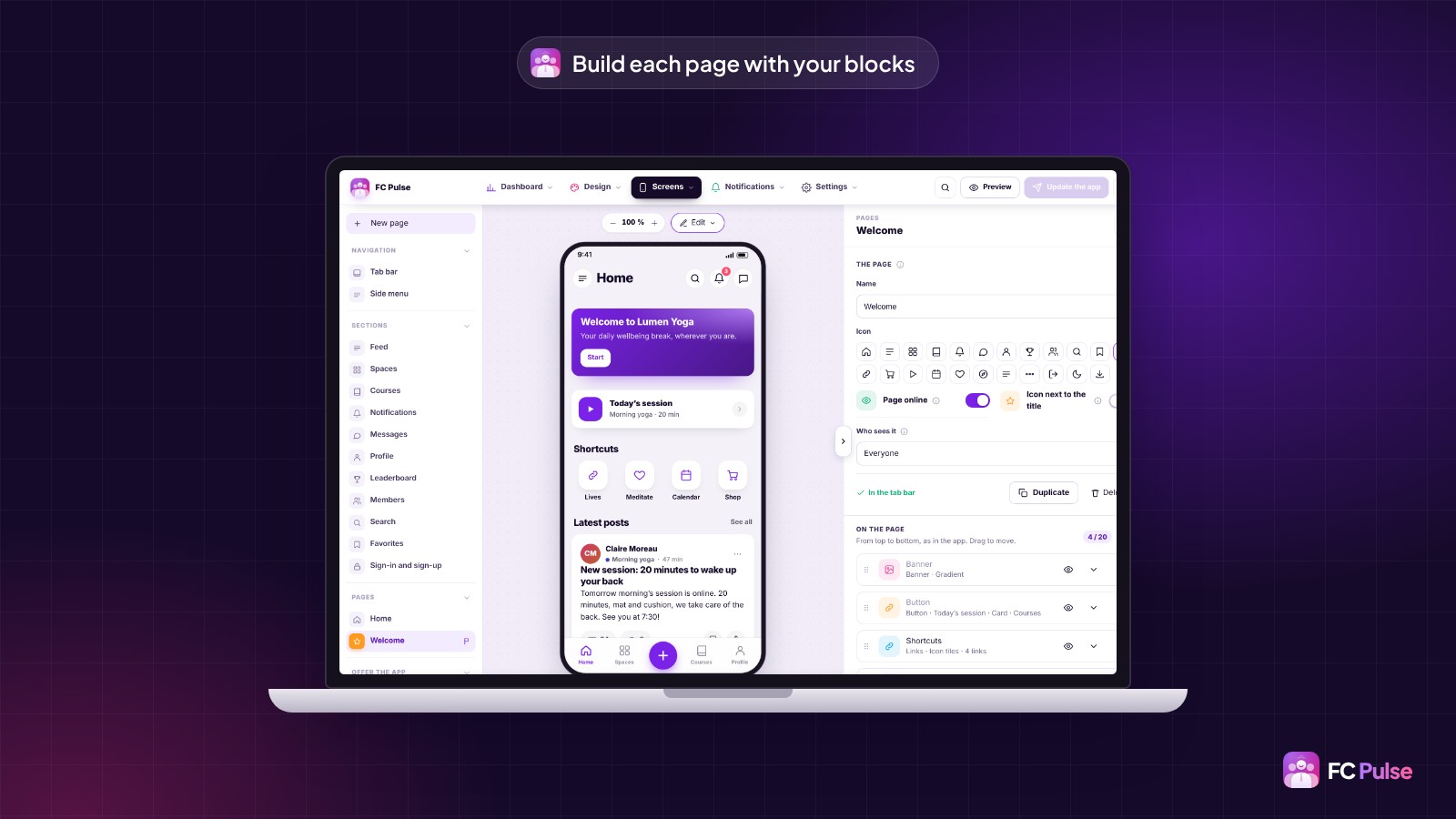
In the builder, you create a page in seconds: a name, an icon, the blocks of your choice, and a button to add it to the bottom menu. You see the phone preview change with every block you add.
- Five ready-made templates save you time: Welcome, Resources, Events, Shop and Links page. You edit them as you like.
- The opening page: the app opens on the screen of your choice, for example your welcome page.
- A page can be duplicated, paused while you prepare it, and show its icon next to the title.
- Statistics show the visits of each page: you see right away what your members open.
25 blocks to build anything
A click on “Add a block” opens the library. Blocks are sorted by family, with a search to find the right one in a word.
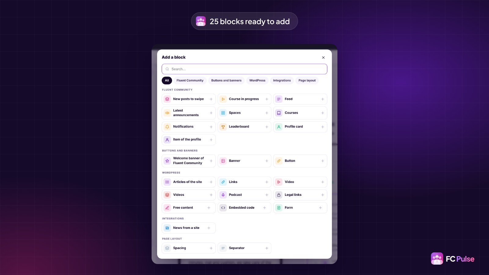
The Fluent Community blocks put your community front and center:
- New posts to swipe, so each member catches up on what they missed.
- Course in progress, to pick up the lesson right where they left off.
- Activity feed, Latest announcements, Spaces and Courses.
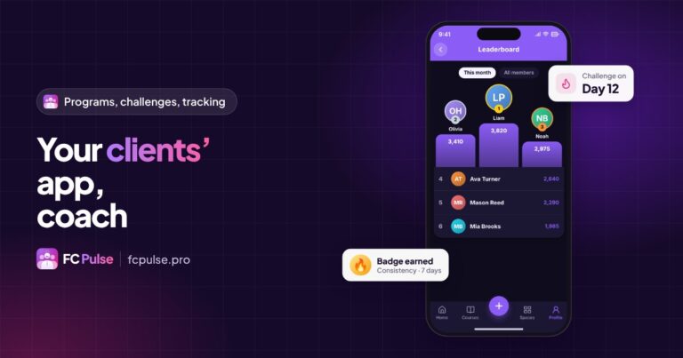
- Notifications, Leaderboard, Profile card and Item of the profile, to show part of the member’s profile wherever you want.
Buttons and banners guide your members:
- Button, in 9 templates (solid, outline, gradient, card, large icon…), to a page of the app, a section or a web address.
- Banner, with title, text, image and two buttons, in 4 templates. It can be dismissed.
- The Fluent Community Welcome banner, in a member version and a visitor version.
The WordPress blocks bring your content together: Articles of the site, Links (in 10 templates, from icon tiles to numbered steps), Video and Videos (Fluent Player included), Podcast, Free content, Embedded code, Form and Legal links. Add to that News from a site, to show the feed of another site, and two layout blocks: Spacing and Separator.
Your blocks on every section
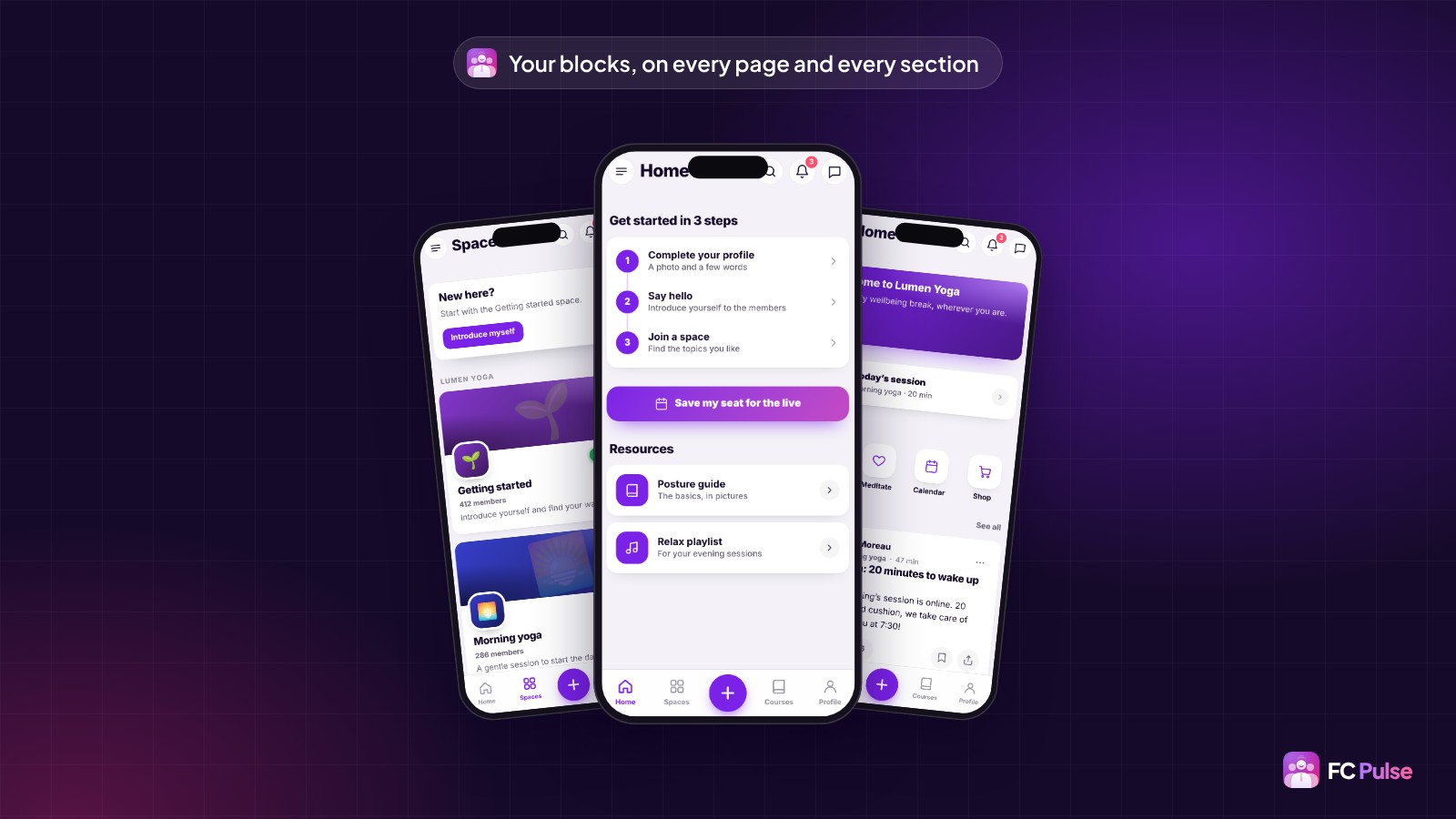
Blocks don’t stop at pages. Every section of the community (Activity feed, spaces, courses, profile and the others) now takes your blocks, above or below the Fluent Community content. A “New here?” banner above the spaces, a button to your live session under the feed: you guide your members where they are.
The profile, courses and Activity feed go further: they split into parts. Each part can be moved or hidden, and your blocks slip in between them. You decide the exact order of every screen.
Role management: everyone sees what matters to them
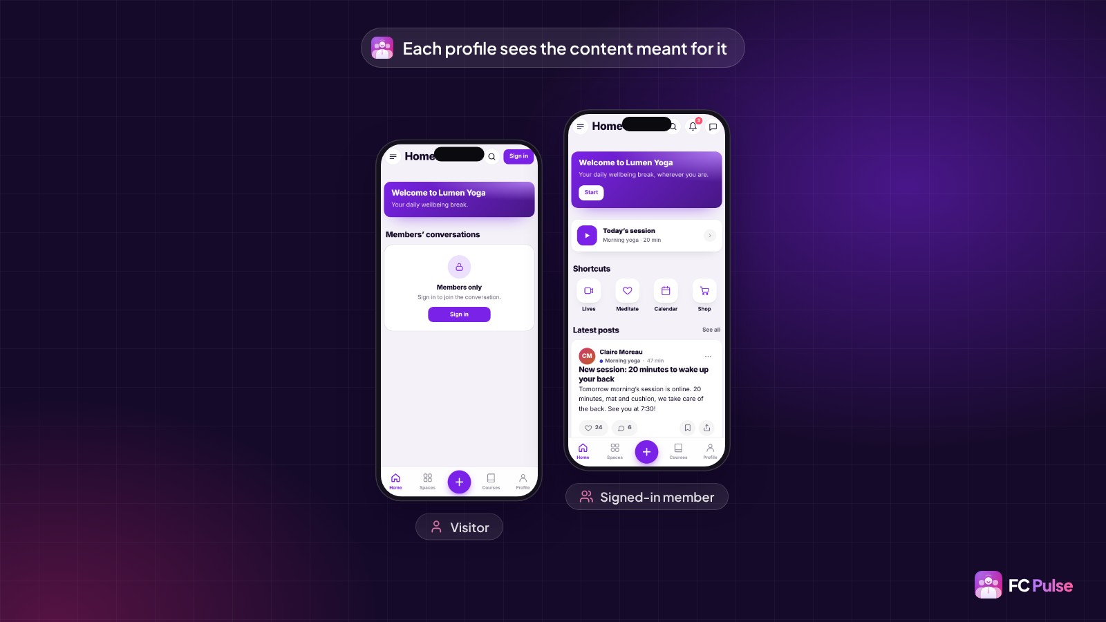
A visitor discovering your community doesn’t expect the same thing as a loyal member, or a customer of your course. With role management, the app shows each person the content meant for them.
Every block, every page, every menu item and every link has its own display setting. You choose who sees it:
- everyone;
- visitors, not signed in yet: ideal for a “Sign in” button or a presentation of your offer;
- signed-in members: conversations, resources, events;
- administrators: your management shortcuts, invisible to everyone else;
- members of a space: content reserved for your customers, your premium group or a cohort.
And when a visitor lands on reserved content, they are not left wondering: a message invites them to sign in, in the template and with the text of your choice. Prefer they see nothing? The block simply hides. One and the same app becomes a showcase for visitors and a private space for your members.
Notifications sent from your own site
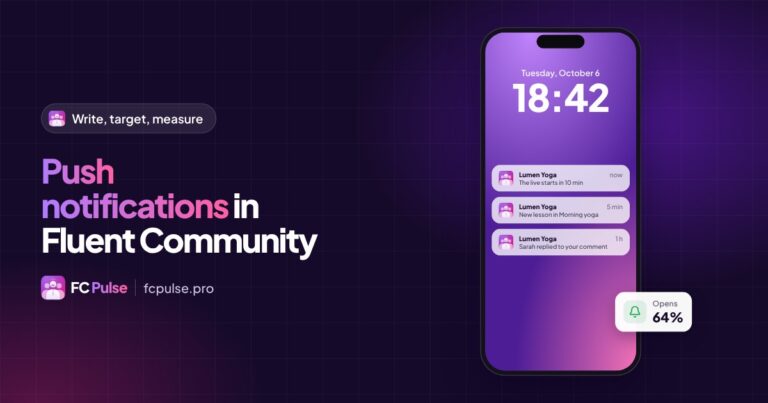
Notifications are the best way to bring your members back. They have been completely redesigned to be simpler, more reliable and more respectful of your data.
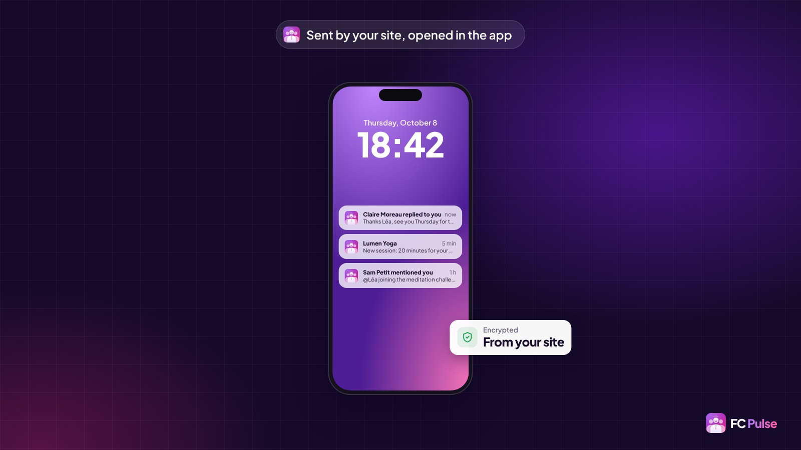
The app installed from your site now receives its notifications directly, through the phone’s notification service. There is no Firebase account to create and nothing to fill in. Each notification is encrypted by your site before it leaves: Apple and Google carry it to the phone without being able to read it, and the list of subscribed phones stays in your WordPress database. Your data stays with you, right down to notifications.
- The comment text in the notification: “Claire replied to you”, then the reply itself. The member knows right away what it is about.
- One tap opens the right content, in the app, even if it is already open. A new WordPress article opens in the app too.
- Each member chooses their notifications, on the phone and by email, space by space. Their email choices are the same as on the Fluent Community portal.
- My phones: each member sees their linked phones, removes one and sends themselves a test.
- Linked phones, on the admin side: every phone with its member, a search, and a button to test the phone of a member who receives nothing. You help them in one click.
On iPhone, a card explains to your members how to add the app to the home screen to receive notifications: that is Apple’s rule. And if you have an app under your own name with Maymoune, a six-step guide walks you through creating the Firebase file it requires. To get the most out of all this, read the push notifications guide.
Your community’s life, on the phone
Everything that brings Fluent Community to life is in the app, with more comfort. Your members interact more, because it is easier.
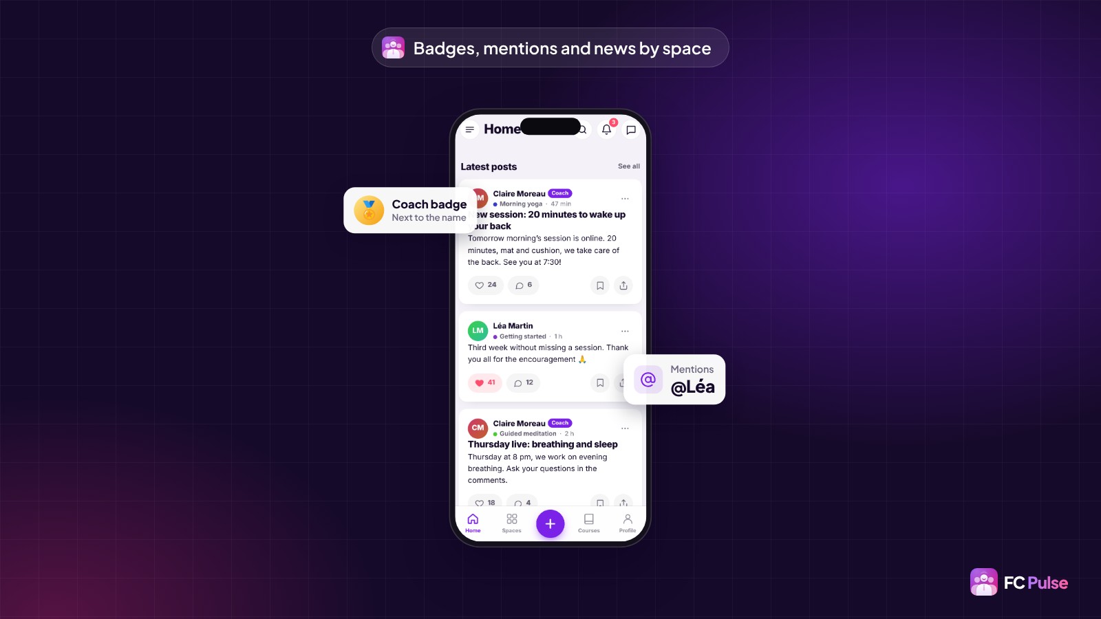
- What’s new by space: each member sees how many posts are waiting for them in their spaces.
- Fluent Community badges and levels show next to names. Your most active members get recognized.
- @mentions: the app suggests members, one tap writes the name.
- Announcement spaces, with their label, where only administrators and moderators post.
- A share menu to WhatsApp, Facebook, LinkedIn, X, Telegram, email and text messages, to spread the word about your community.
- Space links and topics, and course links.
Posting becomes more pleasant too. The New post screen has been redesigned: name and space as pills, colored topics, switches for the announcement email and the poll, clearer polls with an end date, and a “Paste” button to add a video in one tap. Comments get a larger field, quick emojis and a field that stays stuck to the keyboard.
New post, the page of a post and of a lesson, the share menu and navigation within a space each have 4 templates, with their colors.
A side menu that fits your brand
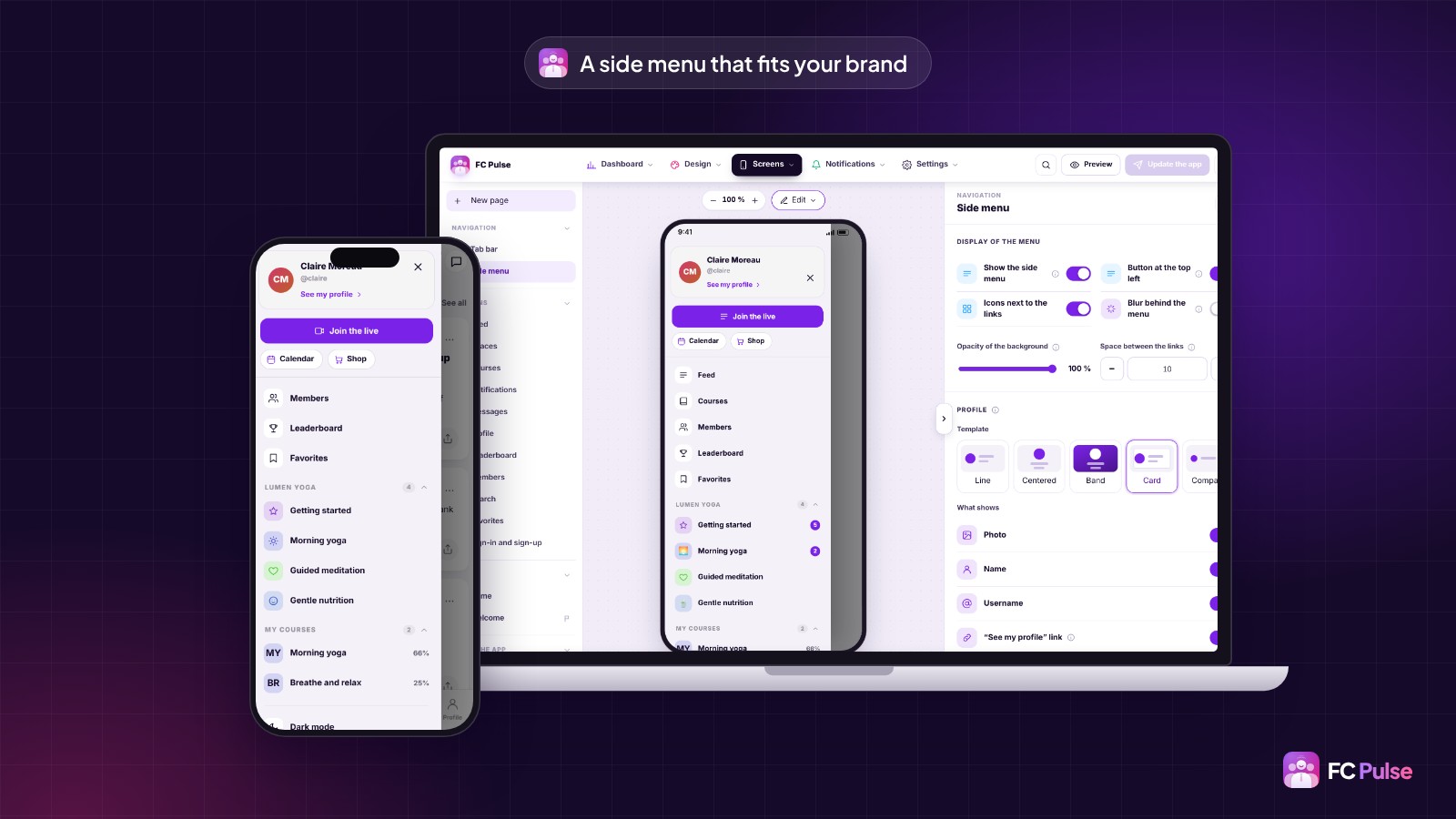
The side menu is often your members’ front door. It is now set in four areas: the profile, the top of the menu, the menu content and your links.
- The profile picks its template from five (row, centered, banner, card, compact) and what it shows: photo, name, username, “See my profile” link.
- The top of the menu and the profile take your links and up to six blocks: button, banner, video, podcast, form, courses…
- Ready-made items: Sign in, Sign out, Dark mode, Install the app. Each one shows only when it makes sense: “Sign in” for a visitor, “Sign out” for a member.
- Each link shows as icon and text, icon only, text only or a large button. Perfect for a highly visible “Join the live”.
- Your icons for the menu rows and for each space, without changing anything in Fluent Community.
Your community on any WordPress page
Your community no longer lives only in the app. FC Pulse adds 14 Gutenberg blocks, in the FC Pulse group of the editor: the whole community, home, Activity feed, new posts, spaces, courses, course in progress, notifications, messages, profile, leaderboard, members, search and bookmarks.
In the editor, each block shows the real section, just as your members will see it. In the sidebar, you choose the template, the number of items and who sees the block, independently of the app settings. A sales page can show your spaces to visitors, and your home page can display each signed-in member’s course in progress.
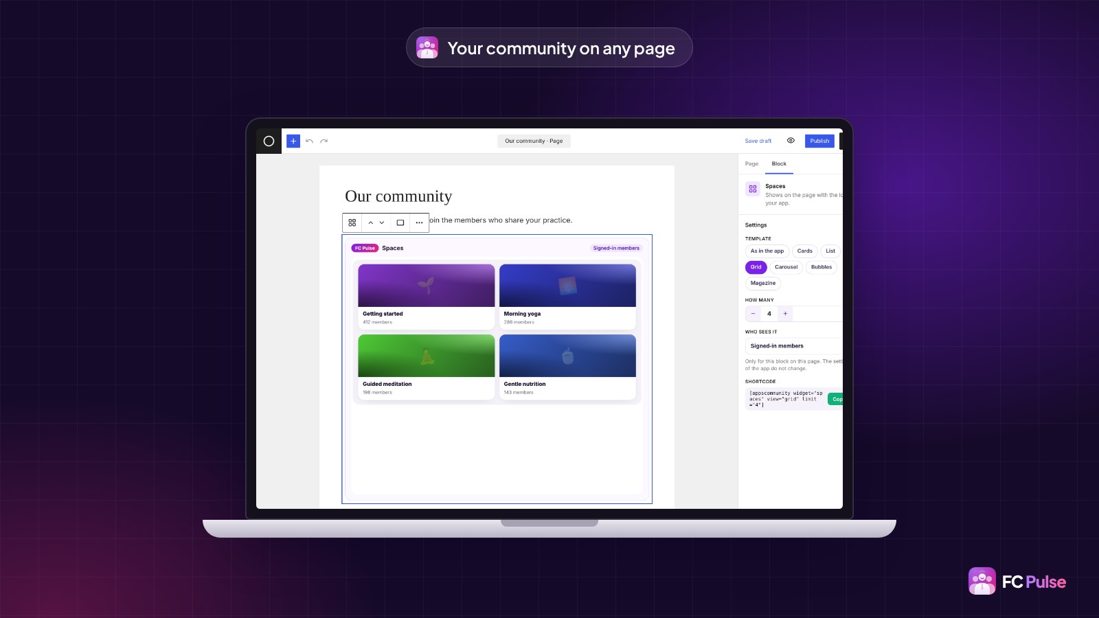
Using another page builder? Each section also has its shortcode. It sits in an “Integration” group, at the bottom of each section, with a “Copy” button.
A dashboard and an editor that save you time
A dashboard your way
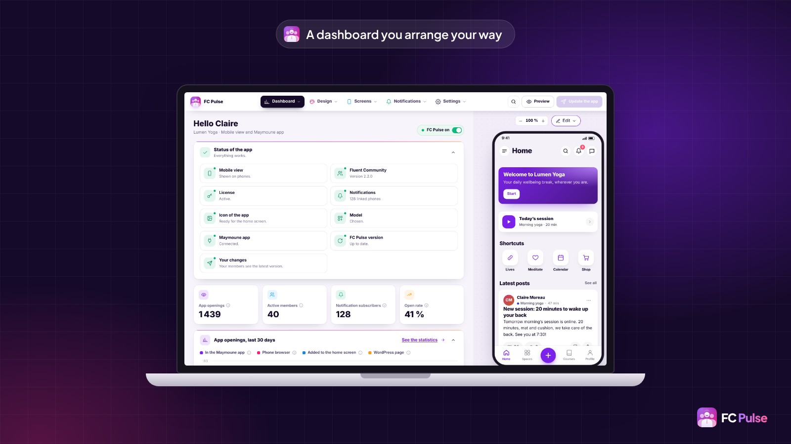
The dashboard has been rebuilt. At the top, the status of the app tells you at a glance if everything is ready: mobile view, Fluent Community, license, notifications, icon, template, your Maymoune app, version and your latest changes. Points to address come first, each with its button.
Below, your key figures: app openings, active members, notification subscribers, open rate, and the curve of the last 30 days. Above all, the dashboard can be customized: each block moves with its handle and switches between full and half width. You put what matters to you at the top, and your layout is kept.
An editor that gets straight to the point
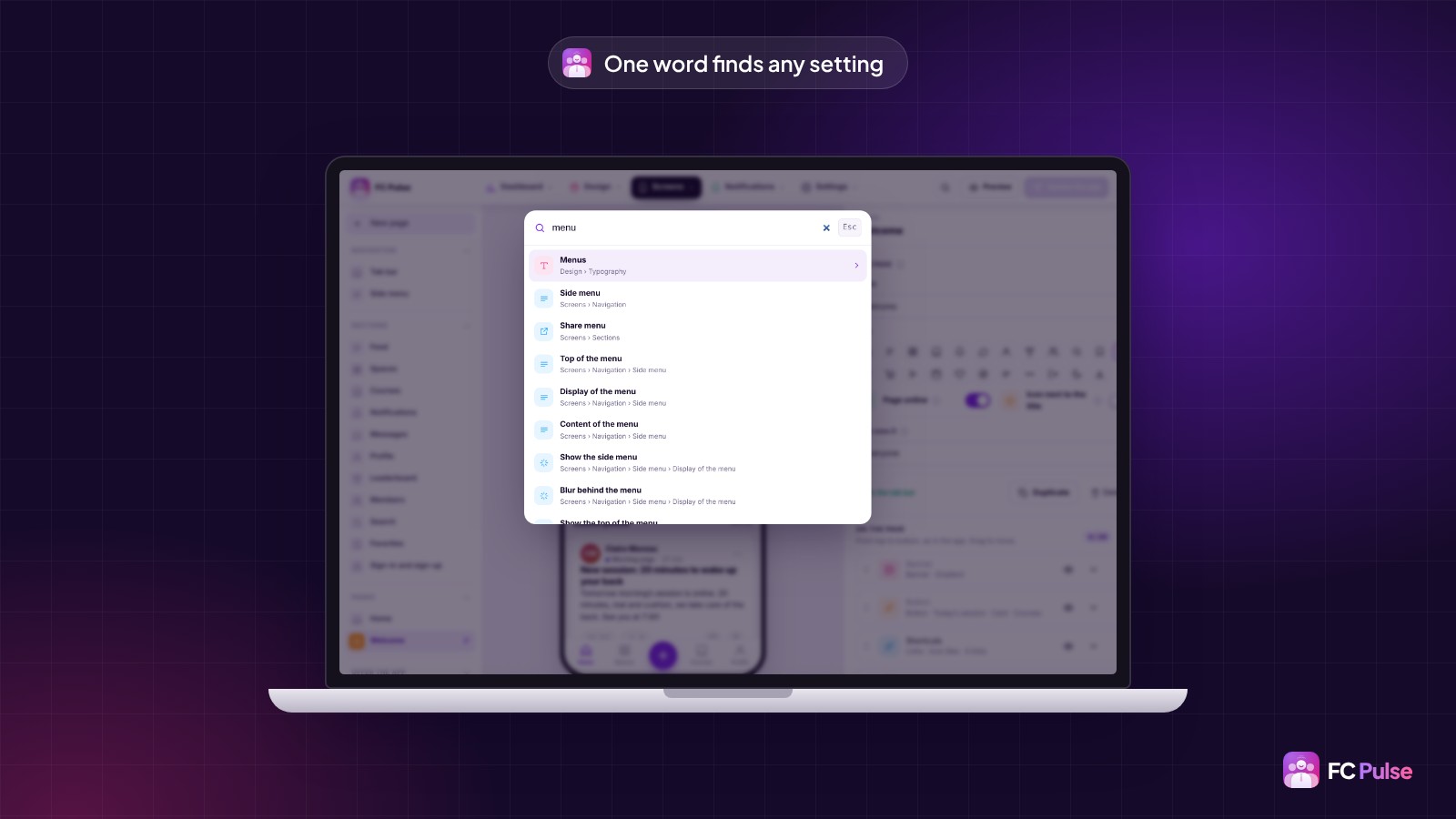
- Search in the settings: the magnifying glass, or Ctrl K (⌘ K on Mac). Type “color”, “logo” or “bottom menu”, and the editor opens the right setting.
- A clickable preview: a tap on an area of the phone opens its setting, outlined in purple. No more hunting for where to set what you see.
- A clearer left column, with groups that fold and a button to fold or unfold everything.
32 improvements, all across the app
Beyond the big new features, this version improves almost every screen. In short:
- Installing on the phone: full-screen opening from the home screen, the right icon, and the install banner also for Maymoune apps opened in Safari or Chrome.
- Appearance: every color in light and dark, corner rounding, sign-in screen colors, the status bar matching the page, and the space image of your choice (automatic, banner or icon), in the Spaces blocks too.
- Menus: up to 8 free buttons in the top bar, logo size, up to 10 tabs in the bottom menu (each person sees the first 5 that concern them), and space and course groups expanded in the side menu.
- Posting and commenting: the new post screen, polls, the “Paste” button for videos, more comfortable comments and more readable fields across the app.
- Signing in: clear messages when sign-in is refused (password, blocked account, two-step verification), and the new posts reader that suggests signing in at the right moment.
- Notifications: the Maymoune app receives them as soon as Fluent Notify is installed, and the FC Pulse Notifications menu is always available.
- The settings screen: folding cards with a summary, lighter Colors and Typography screens, the Fluent Community welcome banner hidden by default in the app, white label on a single line, default settings in one button, the license confirming it is up to date, and a clearer setup wizard.
The details of each one are in the changelog of version 1.14.6.
20 fixes for a more polished app
Finally, 20 fixes make the app more polished day to day. Transparent PNG logos show as they are, with no white frame. Space banners and icons show in full, SVG included. The blocks at the bottom of the home page appear on every phone. The comment field stays stuck to the keyboard, and Fluent Player video titles display their special characters correctly. The full list is also in the changelog.
Move to FC Pulse 1.14 in one click
No need to watch for new versions: FC Pulse tells you. As soon as an update is available, a banner shows at the top of your FC Pulse editor and of your WordPress admin, with an “Update” button. FC Pulse detects it quickly, without waiting for the WordPress check, which only runs twice a day. On the dashboard, the “FC Pulse version” line reminds you too.
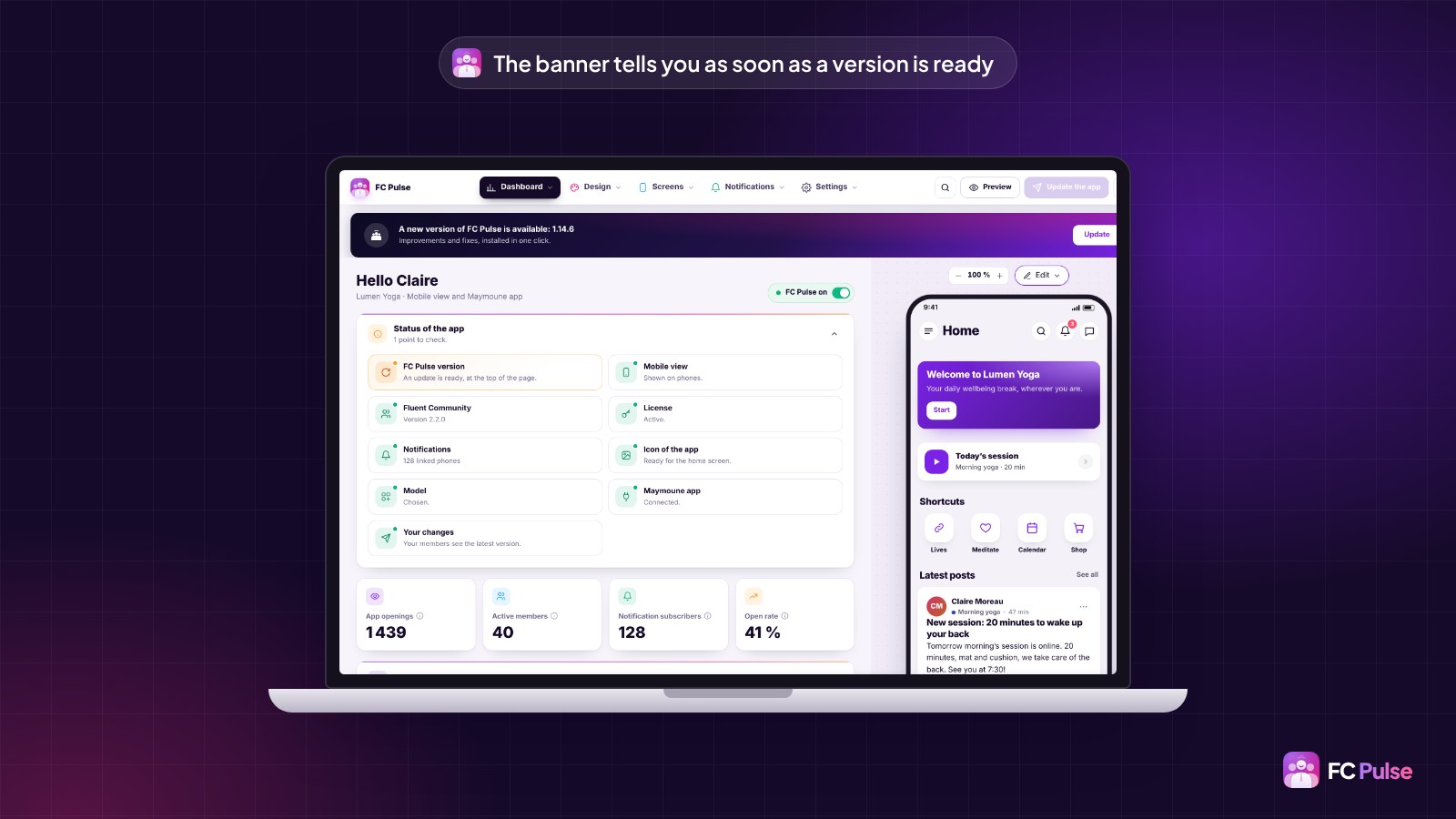
One click on the button, and the update installs before your eyes: a screen follows the download, installation and restart, with your current version and the new one. A few seconds later, you are back in the editor. If something gets stuck along the way, nothing is lost, and the screen tells you how to finish.
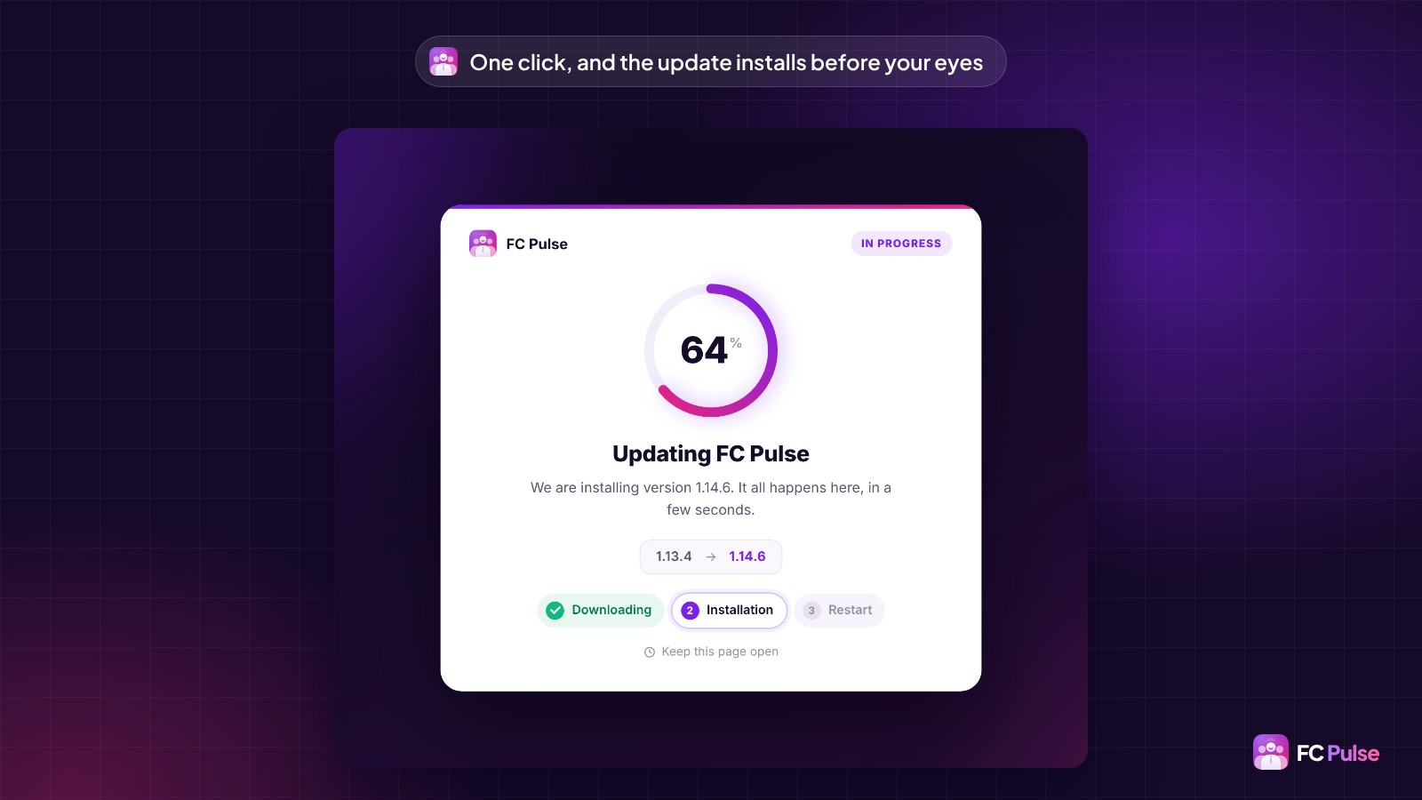
Prefer the usual way? You can still update from the WordPress Plugins screen, like any plugin. Either way, your settings stay in place, and your members find the new features the next time they open the app.
Administrators, editors and authors who use Fluent Auth also get a simpler sign-in: their code arrives by email and is entered right in the app, on a six-box screen.
If you don’t have FC Pulse yet, now is the right time: the Founder offer is still open, for the launch period, on the Founder pricing page.
Founder offer
Give your members an app that looks like you
A lifetime license, at Founder pricing, for the launch period.
✓ Pages built from 25 blocks, your way
✓ Dark mode, your colors and your typography
✓ Each member sees what matters to them
✓ Notifications sent by your site
Read also: why I built FC Pulse, creating your community’s mobile app, the FAQ and the documentation, being written.
To follow what’s new in FC Pulse and talk with other users, join the FC Pulse community on Sdravobiz.
Frequently asked questions
What does FC Pulse 1.14 bring?
56 new features, 32 improvements and 20 fixes: pages built from blocks, dark mode and your typography, role management, notifications sent by your site, a side menu that fits your brand, 14 Gutenberg blocks and a customizable dashboard. The details are in the changelog of the version.
How do I move to FC Pulse 1.14?
In one click. As soon as an update is available, a banner shows at the top of your FC Pulse editor with an “Update” button, and the new version installs in a few seconds. You can also update from the WordPress Plugins screen. Your settings stay in place, and your members find the new features the next time they open the app.
Do my members need to reinstall the app?
No. The installed app updates itself. It also picks up your menu and page changes without your members having to do anything.
How do I show content only to some members?
With role management: each block, page, menu item and link can show for everyone, visitors, signed-in members, administrators or members of a space. A visitor sees a message inviting them to sign in, or nothing at all if you prefer.
Do I need a Firebase account for notifications?
Not for the app installed from your site: it receives its notifications directly from your site. Firebase is only used for the app under your own name on the App Store and Google Play, with Maymoune.
Can I use my own font?
Yes. You add up to four font files (WOFF2, WOFF, TTF or OTF), or you pick a Google Fonts typeface that FC Pulse copies to your site, without loading anything from Google.
How much does FC Pulse cost?
FC Pulse comes with a lifetime license, no subscription, updates and support included. During the launch, the Founder offer brings its lowest price, for a limited time. Every plan is on the Founder pricing page.